 I've been a little lazy with the camera, in part because we drained the battery. You think you have your shot all lined up, and then it just shuts off. It's also been gray and rainy for a while, and though I love all the fog and mist and find those gray days to be pretty good for me creatively, it does make it harder to get nice photos. My best work time, usually, is very very early in the morning and late in the evening-- I think there's something about the non-descript character of the outside at that time (in the dark, or in the gray/overcast days) that lets my mind run free. I'm not thrown off track by external stimulation. Or maybe I'm just a night owl.
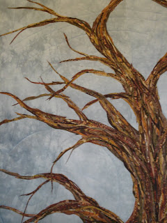 Back to the tree. Here's a before-thread view. I've gone back in and fleshed out some spots, added pieces to tweak the color.
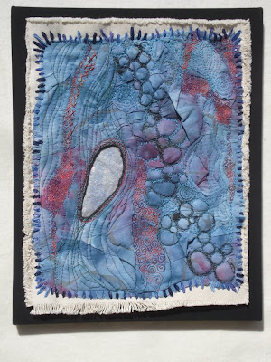
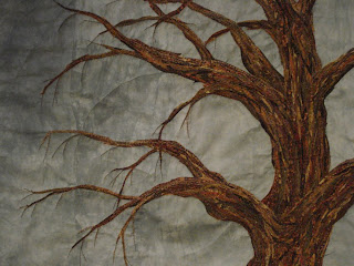 And this is roughly the same area, with thread work (and low light). One of the things I love about working in fabric is being able to add this layer... with something like painting, you create the image and any adjustments or additions you make (while lovely, I'm not knocking painting) are additional layers of the same material-- paint. In most cases. With fabric, you can create the image and completely change the character and direction of the piece simply by adding the threadwork.
The colors and size of the thread used can have a dramatic effect, adding dimension, or pattern, or the suggestion of other meaning that isn't immediately noticeable in the overall image. Deciding what and how to quilt a finished top is something that many quilters struggle with-- what will complement it best? Should I emaphasize one part of the design over another? Should I use thread that matches the background, or go for high contrast? But they're crucial questions. The thread can take a piece from "nice" to "WOW". Sometimes it just serves to liven up the image. I started this piece about 2 years ago, and finally felt "done" this past summer.
 For a long time, it sat here:
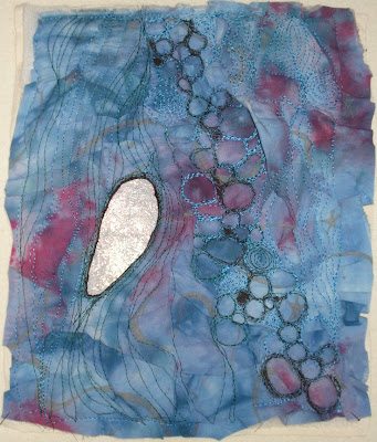
while I wondered what on earth I was doing with it. The reddish-purple bits weren't making me happy and something just didn't feel right. But the thread helps, changes.
All of which is to say, this is a big part of why I love working with fabric- the potential for changing direction and adding depth without losing what you started with.
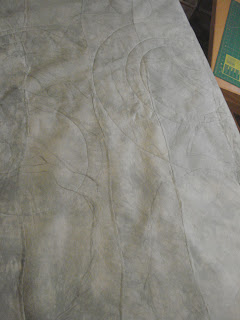 With the pile of brown paints and the teeny rotary cutter, I get busy slicing and shaping.
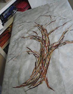 Now the overall shape is clear, moving outwards into the smaller branches, and I start to close some of the gaps.
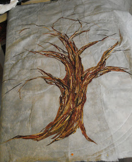 The body gains solidity and more shaping to define the places where there is overlap or a split between branches. I've been tacking things down with the iron along the way, just a brief 2 or 3 second touch to keep the pieces from shifting as I layer and cover gaps. Before moving into the top section I'll slide my small pressing mat underneath and press over the whole lower trunk.
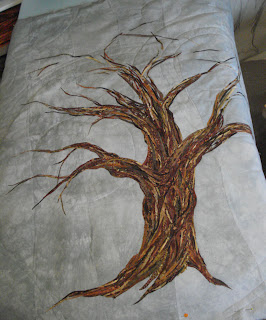 The whole piece is shifted to give me access to most of the top area. It is all resting on a piece of blue insulation foam (the stiff stuff, about 1" thick, that you can find at places like Lowes or Home Depot), which in turn is balanced on the ironing board. Insulation foam is, I think, the easiest and fastest way to give yourself a design wall. You can pin into it and prop it against the wall, or wrap it in flannel-- even a bedsheet would do-- and your fabric will stick to it without pins, great for auditioning fabric placement.
  And the full image:
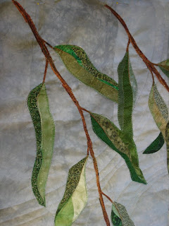
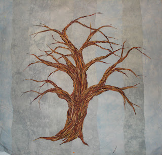 I'll go back in to tweak some areas where it needs a bit more coverage, or where an especially light or dark fabric is leaping out and needs toning back, but overall it's ready for threadwork. Once the thread is in, the foliage will be added and stitched over. But that's for another day....
 New updates on the big project! I managed to get a few photos while the light was nice and sunny. All the color lay-in is done on the side panels and I'm cutting for the center panel, which is the most delicious part for me. I love putting the trees together.
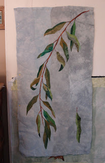 This is the left side panel, with the right up at the top of the post. From this point, they're ready for threadwork, and then will be stretched on a wood frame. Once this project is done, I'll do a post with some step-by-step photos showing how I do that part-- this one will be a bit unwieldy to get pictures along the way. The side panels are 24"x48" so I'll need both hands...
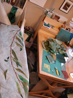 My pile of green paints is on the table, along with several small rotary cutters, scissors, and the all important tweezers, which make arranging small pieces much easier.
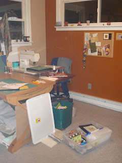
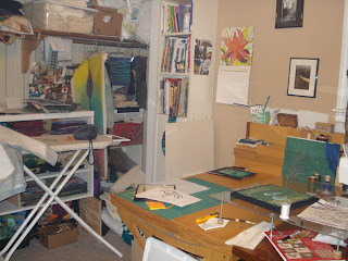
 Lots of pictures today and then I've got to get down to biznaz...
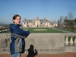 Again, tons of visual feasting. We didn't really get any photos of the house up close (and of course no photos allowed inside)... we end up looking at all the teeny stuff or architectural details that most people won't bother with. There's gargoyles everywhere and they're ALL DIFFERENT. The amount of design that went into all the individual decoration is mind boggling. There's a neat little exhibit in one of the basement rooms that shows a lot of the construction of the house, including a photo of some of the zillions of plaster models made by the architect as a guide for the stone carvers. I can't imagine how many crates full of models got shuttled back and forth from NYC to Asheville while all this was going on.
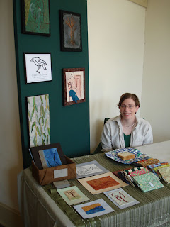


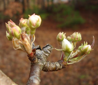
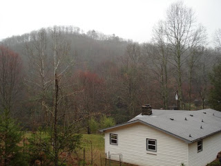 Took a work break this afternoon to let Lucy run around outside-- as much as she can when she's still attached to me-- and the richness of color was too good to pass up. It doesn't show well by camera, but the trees almost glow with the moss and the damp. This is taken from up the hill at the back corner of the house. We're sort of situated in a bowl, with mountain ringing us on all sides, so the weather can be a little strange. The peak across the street wasn't even visible until close to 1 pm.
 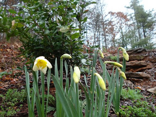 The next few days are supposed to be warm and sunny, so I'm glad for the rain right now. Everything is perking up, and I'll be able to get my photo set-up back out in the sun to get pictures. I like color, which means there are very few places indoors to pose artwork for a clean, neutral photo.

 The idea is to punch holes in the paper, so that you can rub chalk or charcoal powder over your drawing and end up with a nice dotted line that replicates your original drawing. You need something firm but puncturable underneath as you trace-- I have a piece of foam core board-- blue styrofoam insulation panels also work well, or even a piece of corrugated cardboard. I'm punching through newsprint, which goes quickly, but if you're looking for a multiple-use template or stencil you might want to try kraft paper instead.
 The side panels have been transferred and layered with batting as well, and are on their way to being quilted, then highlighted with metallic thread. Almost to the fun part...
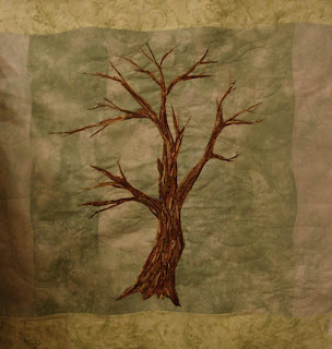
 This one has had what I think of as "anchor" stitching done, and the background quilted. The body of the tree has been stitched enough to hold everything in place, and the tips of some of the branches have been extended a bit. Foliage and additional branches will get added, a good deal more threadwork, and then it'll be stretched on a frame for hanging.
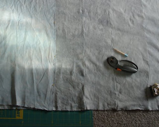
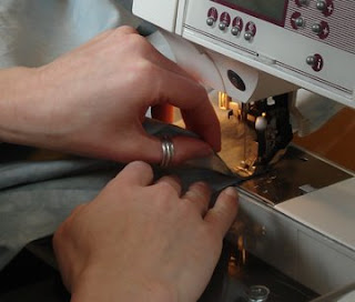
 Make registration marks to give yourself a guide for lining up the two pieces when you're sewing. I put some pins in to hold them together until I'm closer to the sewing machine, but mostly because it's such a long seam. For smaller pieces, just the marks will do.
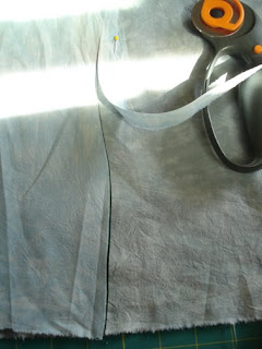
 I find it easier if I keep the top fabric lifted slightly, and just keep easing the curves...